Logo T'potje van hier
Project context
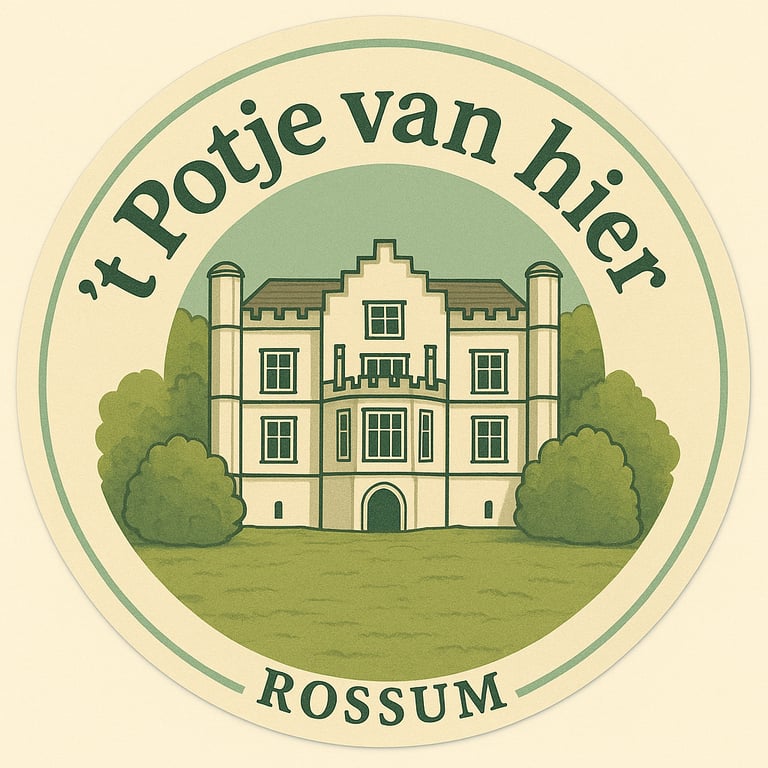
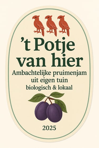
For my brother’s homemade plum jam, ’t Potje van Hier, I designed a logo that combined local identity with a traditional look. The logo needed to represent authenticity and heritage, while also being versatile enough to fit on different types and sizes of jam jars.
Approach
Following the IPO design process, I started by analyzing local symbols and aesthetics. I incorporated elements of our village logo and a traditional shield, creating a design that felt both personal and rooted in local culture. The biggest challenge was ensuring the design would adapt seamlessly to various jar shapes and labels while maintaining readability and style.
Tools & Techniques
IPO design process
Adobe Illustrator (vector design)
Local heritage research
Label design & layout adaptation
Outcome
Reflection
The final design was an authentic and flexible logo that worked across all jar sizes. By combining local symbolism with a traditional aesthetic, the logo gave ’t Potje van Hier a recognizable and meaningful brand identity.
This project taught me how to design for both authenticity and practicality. I improved my skills in creating logos that not only look good, but also adapt to real-world applications such as packaging and branding.